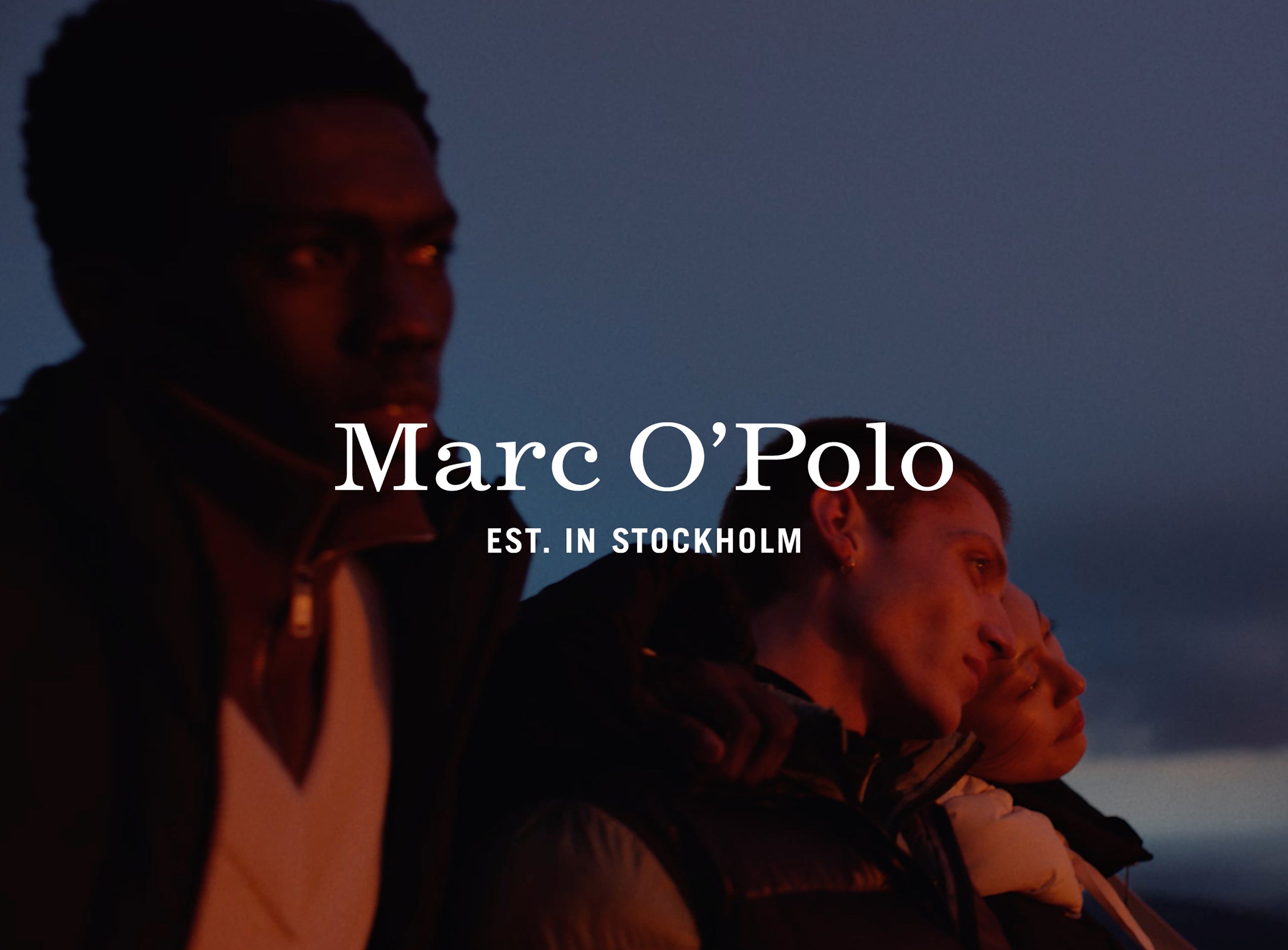
Fashion Brand Marc O’Polo was founded in 1967 in Stockholm and is known for using natural and sustainable materials.
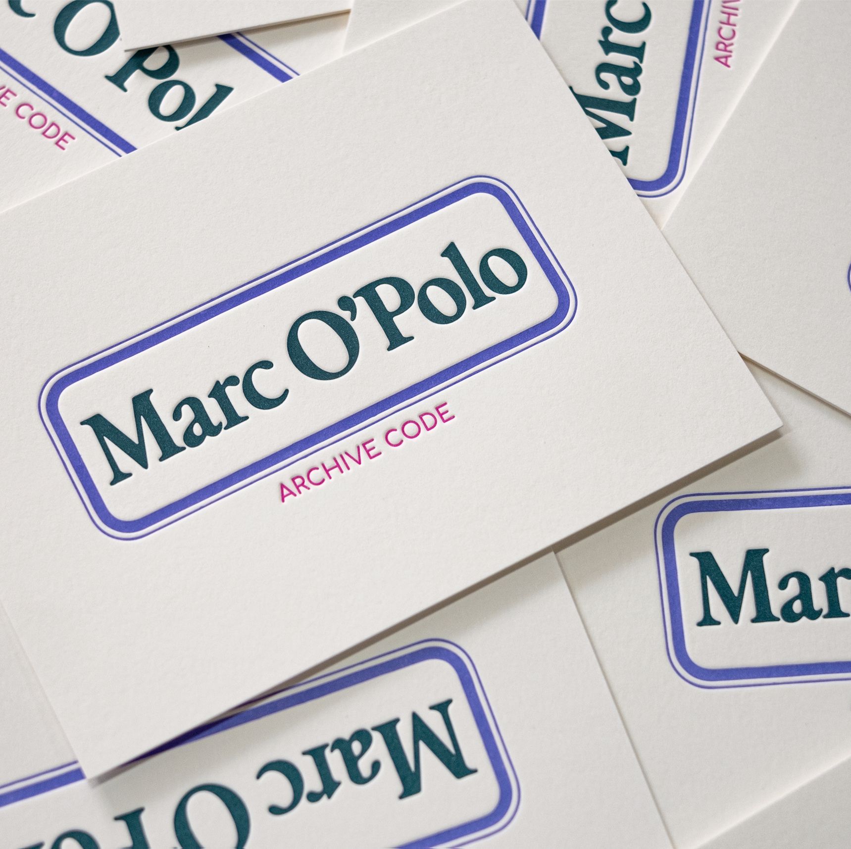
To start a new and contemporary brand strategy, we were commissioned to redesign its brand identity—logo, icon, typography, layout system and colors as well as the overall product branding and packaging. The main goal was to simplify and unify the design language and create a recognizable and clear graphic system. Striking and easy-to-use, it marks all inside and outside labelings, packagings, print and online uses in a contemporary and coherent look. We have softly redesigned the logo. The serif font was tightened and slickened, and a gothic subline points out the brand’s origin and design approach. The reduced icon encloses the letters MO’P in a clean square. We have developed two customized corporate fonts—based on the heritage but with a contemporary finish. The color scheme is mainly grey and white with splashes in green, blue, orange and purple to define different lines and actions.
The identity was honored by the German Design Award 2023 and the German Brand Award 2022.
Corporate Identity: WVH
Corporate Fonts: WVH & Office for Typography
CI Videos: BUS Group with Sound Designer ateq

Marc O'Polo Rebranding , Marc O'Polo, 2021